Developed by MET ETI
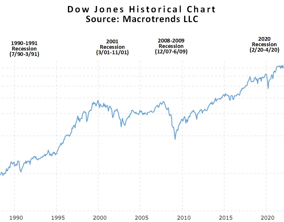
Move the slider under the Dow Jones historical chart to see how the Treasury Yield Curve changes over time. As you move the slider, you can read more information about significant increases and decreases in the Dow Jones Industrial Average stock market index over the past 30 years. Note the behaviour of the curve before each of the recent recessions since 1990 (grey areas on the chart). Move the slider over to the grey boxes (recessions) to read more information about each recession. Click on the blue boxes to see significant positive annual change increases in the Dow Jones Industrial Average (DJIA) stock market index.